How To Use the 60-30-10 Color Rule in Your Next Home Design Project
Unleash your inner interior designer with this simple formula


If flipping through the latest issue of your favorite design mag did nothing to stir your creative juices for a magazine-worthy interior design scheme, it’s time to try the 60-30-10 rule. This tried-and-true formula helps you balance three central colors in one room, creating a foundational scheme full of color pops and splashes. The best part? The rule has as many configurations as there are colors in the rainbow. It’s truly up to you to find the best three shades that match your home, lifestyle, and personality. Here’s how to use the 60-30-10 rule during your next design project.
What is the 60-30-10 Rule?
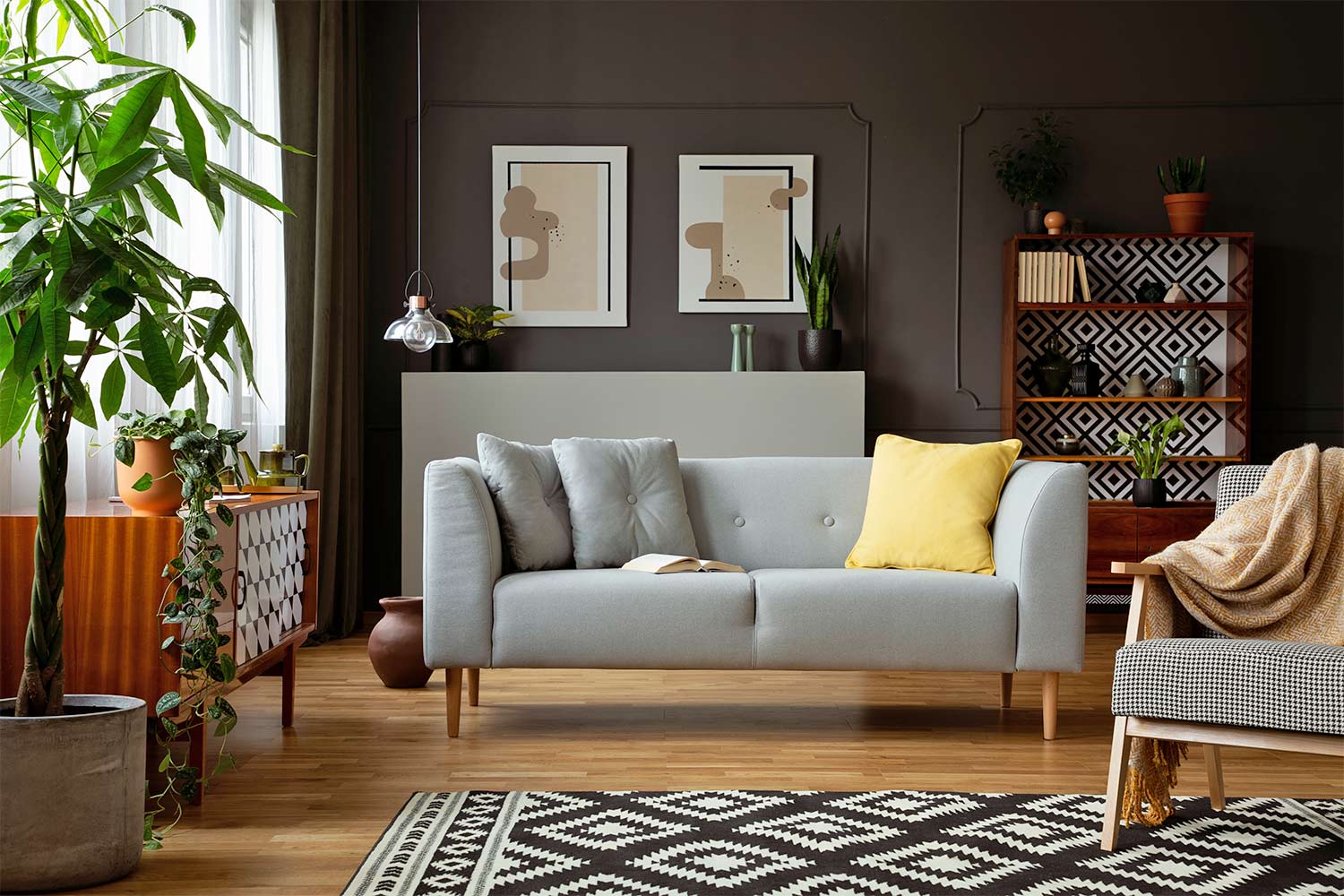
The 60-30-10 is a classic rule of interior design. When defining a color scheme under this rule, it states that 60% of your space should be one dominant color, 30% a secondary color, and 10% an accent color.
The secondary color should complement the dominant color but still pop. The accent color is your opportunity to add a lot of fast flair through fun accessories, artwork, and decorative pieces. Here are some ways to use the rule in a room:
Ideas for your dominant color (60%):
Walls
Rugs
Large furniture like sofas or sectionals
Ideas for your secondary color (30%):
Curtains
Accent or side chairs
Bed linens
Accent walls
Ideas for your accent color (10%):
Throws
Pillows
Artwork
Frames and accessories
Creative Ways To Leverage the 60-30-10 Rule for Your Space
Here are a few suggestions of ways you can use the 60-30-10 rule to create some professional-looking pizazz in your home.
1. Choose a Bold Primary Color
In a bathroom, where white is almost always the dominant color, consider a brighter tone. You might try a primary pastel blue or pink color for your walls (using variations of the same color for your tiles) and then leverage an all-white vanity, lounge chair, and shelves to establish your secondary color. With these palettes, your accent color could be beige, grey, or even a toned-down metallic.
Soft green or yellow tones are simple ways to freshen up your bedroom, provided you balance the rest of the room according to the rule.
2. Do a Dark Wall
If you love the idea of a dramatic black or dark navy wall, the 60-30-10 rule will help you implement this bold choice to the perfect degree. Consider pairing a dark wall with lighter, softer neutrals, such as beige, white, or pale grey.
Just don’t forget to factor in the color of your more permanent room features; a dark wall might clash with dark wood floors and furniture. But teak and other lighter wood tones? Those will pop in all the right ways!
3. Say Yes to Wallpaper
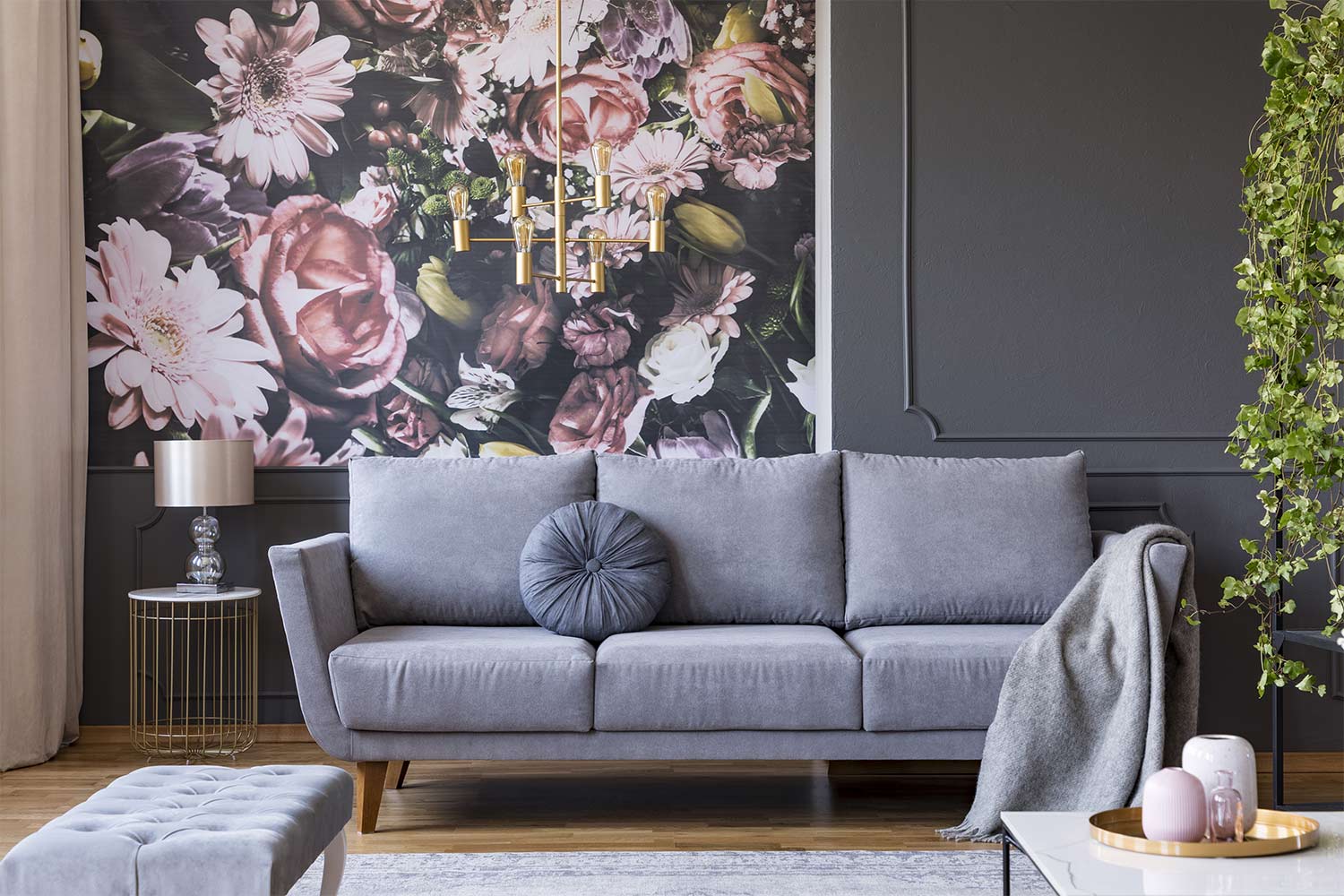
Believe it or not, the 60-30-10 rule works beautifully with wallpaper, especially if it is multicolored. For example, a floral print wallpaper with shades of pink, green, and blue could act as a primary color alongside a neutral secondary color. Just choose an accent color that highlights some of the shades found in the wallpaper, and then incorporate it via decorative pillows or a small painting.
It’s OK To Break the Rule Every Now and Then
Don’t be afraid to deviate from the 60-30-10 rule if these design ideas have you feeling confident and defiant. Here are a few ways to color outside the lines:
1. Aim for 110%
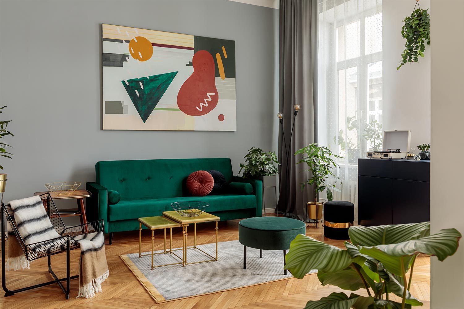
What if, instead of choosing one accent color, you choose two? Under your new formula (60-30-10-10), you could design something like grey as your primary color, green as your secondary color, and yellow and beige/gold as your two accents.
2. Use One Color, But in Various Shades
Monochromatic designs can be just as stunning. For example, if you love pink, commit to pink. Then use the rule to vary your hues and textures in the room. Consider using hot pink, baby pink, or a complementary shade of mauve in your interior design. Wallpaper with a print in the same color family you’ve chosen is another excellent way to vary pattern and texture in a space.
3. Play With the Formula
The formula is not so much about ratios as it is about varying colors. Every space is different, and it’s possible that a different formula works for your home. Whether it’s 30-30-20-20 or 50-40-10, stick to a plan so your color scheme doesn’t spiral out of control. A local interior designer can help brainstorm ideas if you find yourself stuck without a vision.